
A Guide to Mobile SEO For Luxury Brands
In today's digital age, the significance of mobile SEO for luxury brands cannot be overstated.
With a staggering 62.5% of affluent buyers favoring mobile phones for their luxury shopping, now is the time to nail a foolproof mobile SEO strategy.
In this article we look at the nuts and bolts of mobile SEO and why it’s an important component of marketing for all companies — particularly luxury brands.
What Is Mobile SEO?
Mobile SEO involves optimizing websites to rank highly in search engine results pages when accessed via mobile devices like smartphones and tablets. This type of SEO ensures that websites provide a seamless and user-friendly experience for mobile users — which is important considering that 64% of web searches are done on mobile devices.
Mobile SEO shares many of the same best practices as SEO for web, but it is still crucial to optimize the mobile experience. This includes adapting to different screen sizes, optimizing page speed, tailoring content for mobile consumption, and conducting keyword research specific to mobile users.
Why Is Mobile SEO Important For Luxury Brands?
Mobile SEO can attract more traffic, and improve user engagement and conversions. By implementing effective mobile SEO strategies, luxury brands can stay relevant and accessible, reaching their target audience effectively and providing a positive user experience across all devices.
Let’s dive a little deeper.
GOOGLE PRIORITIZES MOBILE
Google knows that the majority of people are searching and browsing on mobile. Back in 2020, the company switched to mobile-first indexing for all websites, meaning that Google's web crawler prioritizes indexing the mobile version of a website's content over its desktop counterpart.
SHOPPERS RESEARCH THEIR PURCHASES ON MOBILE
One study found that 56% of shoppers research products on their phones while they’re in store before they make a purchase. Having a mobile-optimized site makes this easier for them and is therefore more likely to result in a sale.
AFFLUENT BUYERS PURCHASE ON MOBILE
When it comes to online purchases, the majority (62.5%) of affluent buyers prefer to do their shopping on mobile over desktop, even among those over 40.
This statistic has risen from only 22% a mere decade ago — so this number will only continue to climb as we live in an increasingly connected world.
Making things easy for these mobile purchasers, with user-friendly sites and seamless transactions, can have a great impact on your bottom line.

A GOOD USER EXPERIENCE IS MORE LIKELY TO RESULT IN A SALE
Nobody wants to deal with illegible font, slow load times, and broken links. And if you’re faced with all of these issues, what’s the likelihood you’d follow through with a purchase?
Users are 67% more likely to complete the buying process if the website is mobile-friendly. By simply including mobile SEO in a marketing strategy, brands can make consumers far more likely to follow through with a sale.
USERS REMEMBER THEIR EXPERIENCE
Not only will a good user experience be memorable, but a bad one can also tarnish a brand’s relationship with the consumer. Three-quarters of online users will return to a website that is mobile-friendly, while 52% say that a bad mobile experience made them less likely to engage with a company.
7 Mobile SEO Best Practices in 2024
Mobile SEO should be a non-negotiable in this day and age. Here are some best practices to keep in mind when designing a mobile SEO strategy.
IMPROVE SITE LOAD TIME
We’re impatient people. Nearly half (47%) of users won’t wait longer than two seconds for a website to load, so it's essential that your site has a fast load time.
As a luxury brand, it's important to convey that sense of status on your website, through high-res images and high-quality video. However, this can take quite some time to load, especially on mobile. Check out Google’s list of tips for creating high-performance and dynamic websites without sacrificing load time.
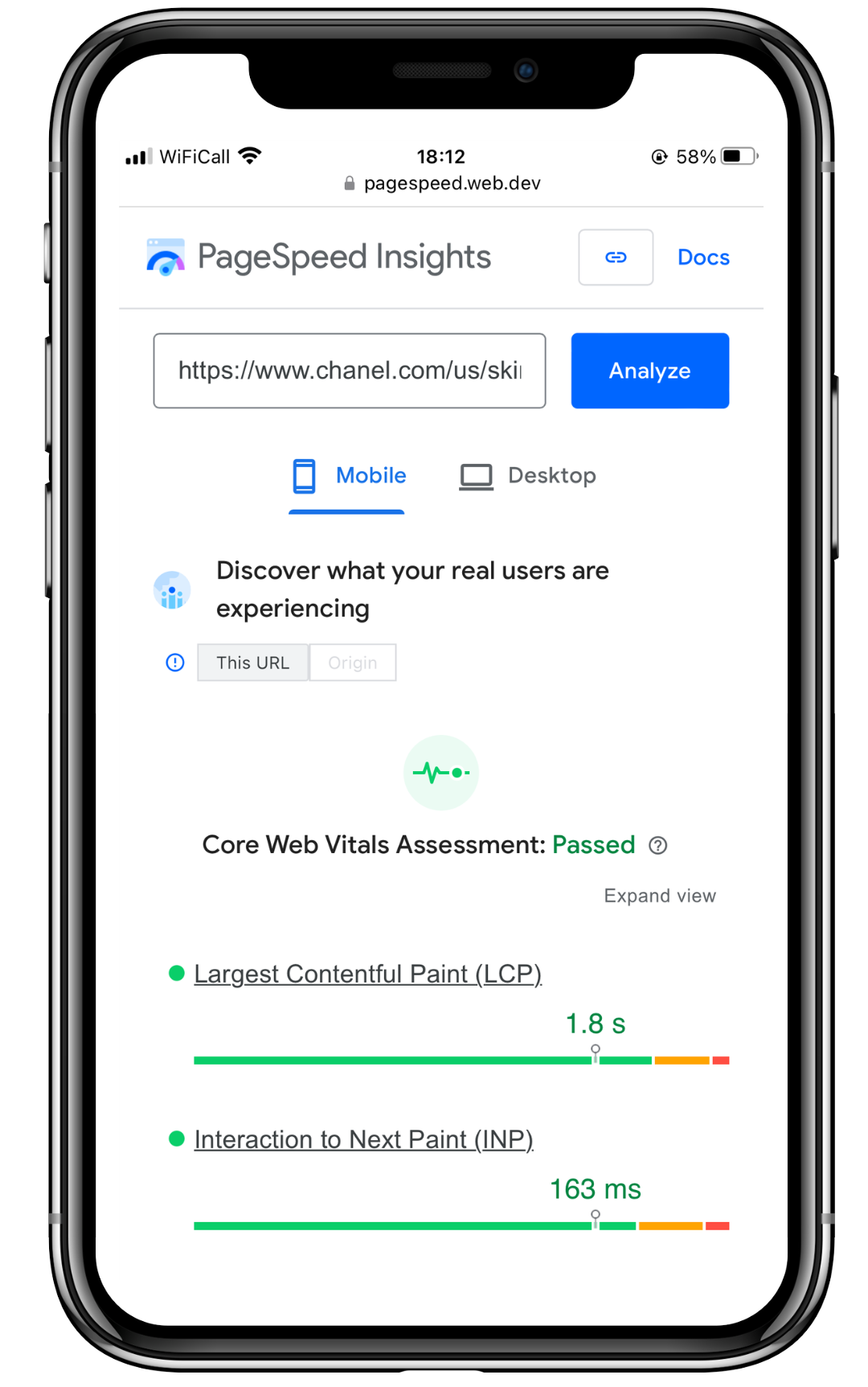
Chanel Skincare passed the page speed test with flying colors! You can test your website’s speed here too.
IMPLEMENT A CLEAN NAVIGATION
Don’t overload your pages with elaborate menu bars and navigation options. Over 60% of people said that if they were on a mobile site and couldn’t find what they needed straight away, they’d navigate somewhere else.
If you make your page too cluttered, you could lose out on potential sales… and give them to your competitors.
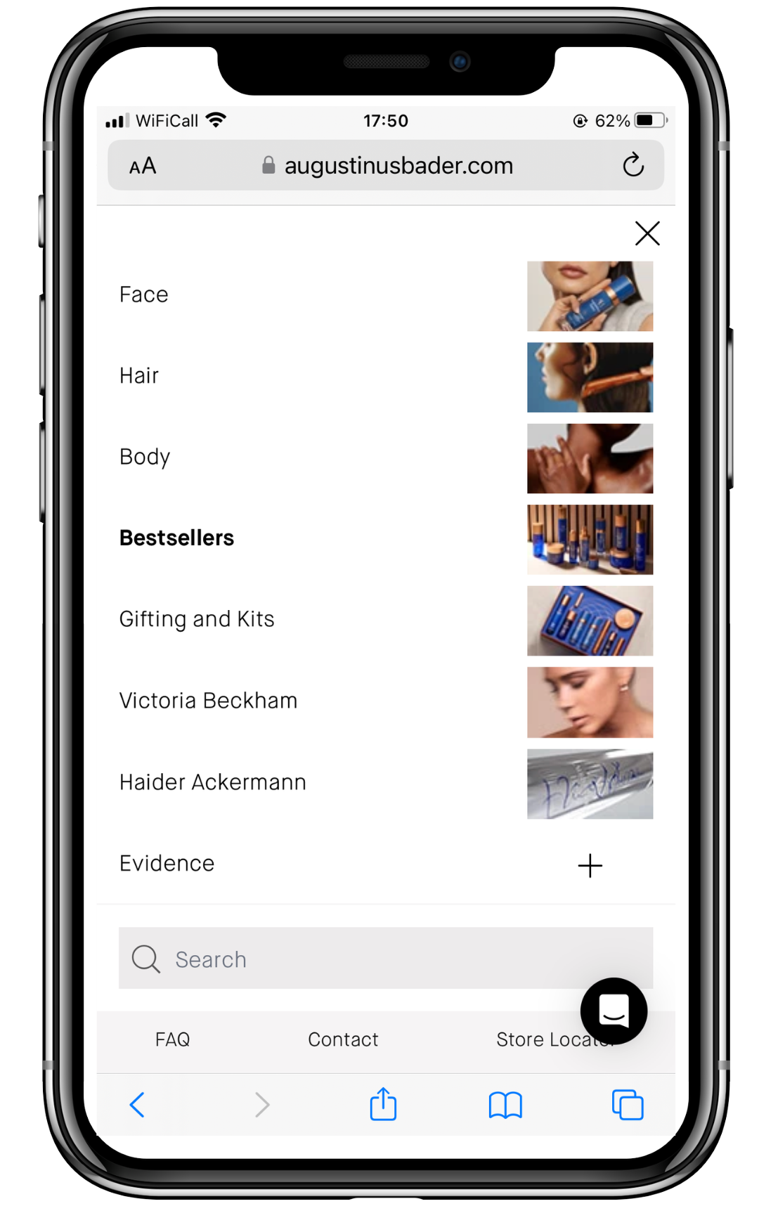
Augustinus Bader, for example, have a simple navigation that is broken down by usage (face, hair, body), and then by product and routine. It even includes images to make it more engaging.
CREATE MOBILE-FRIENDLY CONTENT
We’re well and truly in the age where online content needs to look just as good on mobile as it does on desktop. And consumers agree — 48% said that if a site didn't work well on their smartphones, it made them feel like the company didn't care about their business.

Some tips for making mobile-friendly content:
Make sure the font is legible - in terms of size, style, and color
Keep paragraphs short and easy to skim
Add images and videos to keep it visually engaging
Include interactive elements, like clickable buttons
Avoid pop-ups
Temple Spa, for example, keep the paragraphs within their blog content short and concise, so entire sections fit within a mobile screen. They also bold headers to make them stand out and add imagery to keep users scrolling.
USE RESPONSIVE DESIGN
Responsive design means the website's look and shape adapts to the user's device automatically, whether it’s a smartphone or a tablet. This makes it easier for users to browse your site without having to resize or zoom in.
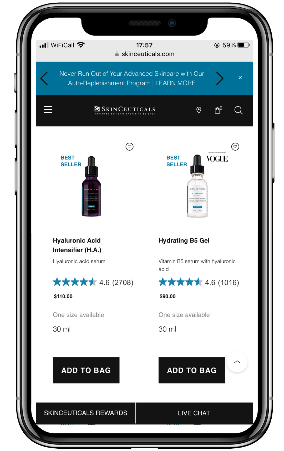
SkinCeuticals do this flawlessly within their category pages. All product images, information, reviews, and costs are highly visible and the CTA buttons are large and clickable from a mobile device.
HAVE SEPARATE MOBILE URLS
Instead of using responsive design, some brands opt to create two parallel pages, one for mobile users and one for desktop — the mobile one has an "m" subdomain which sits just after the https://.
La Mer, for example, host their mobile website on the subdomain m.cremedelamer.com

Having a separate mobile URL allows tailored optimization for these users, ensuring faster load times, simplified navigation, and enhanced user experience.
We know that having your page designed specifically for mobile users — with optimized layout, design, and functionality — is essential. It not only improves mobile search rankings but also enhances user engagement and conversion rates.
OPTIMIZE CONTENT FOR LOCAL SEARCH AND VOICE SEARCH
'Near me' searches — which often take place by someone who is ready and able to make a purchase — are location-based search queries that are far more likely to be made on mobile devices.
People often search with phrases like “near me,” “open now,” and “where can I buy”, which gives brands an opportunity to reach new customers through searches. Adapt to these local searches by using keywords — like “jewelry maker in New York” or “flower shop in downtown Nashville” — on your site.
Voice search is increasingly more common too, thanks to Siri and similar functions, meaning that brands should consider this when creating content. Optimize your content for conversational or semantic search. For example, include keyphrases like “where can I find a homewares store near me” rather than just “homewares in Boston”.
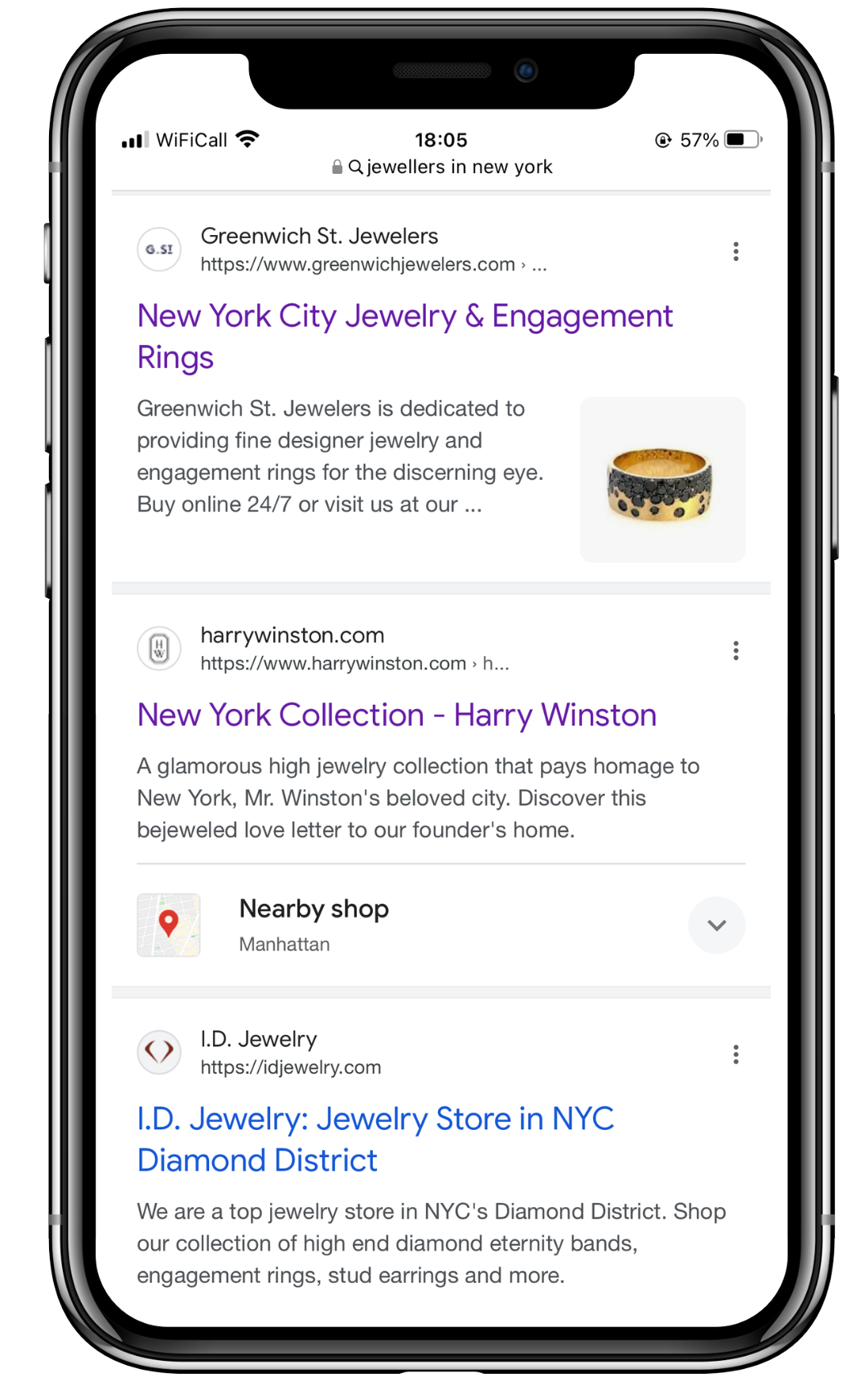
Greenwich St. Jewelers have optimized their homepage around local searches for ‘jewelers in New York’, helping mobile users find their website.
OPTIMIZE TITLE TAGS AND META DESCRIPTIONS
Your title tags and meta descriptions are an essential part of mobile SEO. Mobile users often browse search results quickly and on smaller screens, making concise and compelling titles and descriptions is essential for grabbing attention and encouraging clicks.
Your title tag is the first thing a browser will see of your site in search results. Use your main keyword at the front of the title, so your audience knows your listing is relevant to their search query.
The meta description appears below the title, providing a short blurb about what users can expect when clicking on your site. Make it short and descriptive, divulging just enough information to get people to want to keep reading.
Be sure to fill out the title tags and meta descriptions for every page on your site, from blog posts and product landing pages to your homepage and contact section.
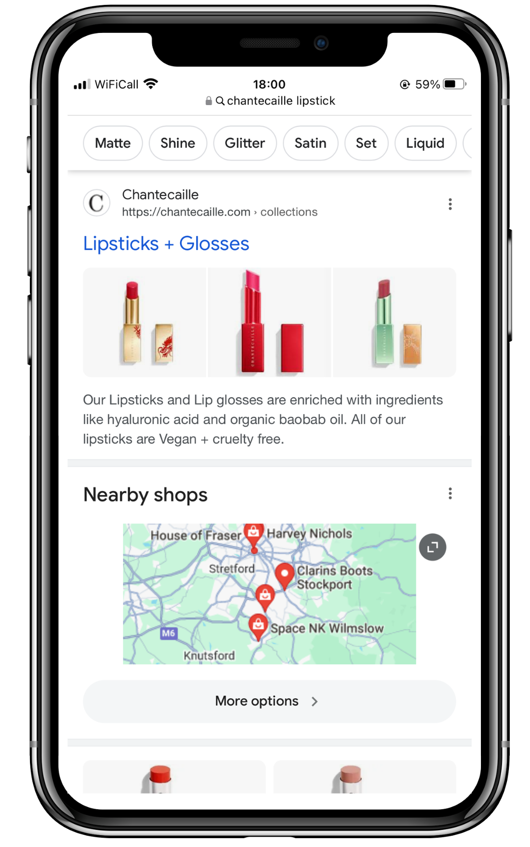
Chantecaille are a great example of mobile-optimized meta data. In the below example, the title is just a few characters long yet it clearly communicates what product can be found on that page. The meta description also appears in full, communicating the ingredients used and the products’ qualities.
Block & Tam Know Their Mobile SEO
The data speaks volumes: with a significant majority of affluent buyers preferring mobile platforms for luxury purchases, mobile SEO for luxury brands is essential. By focusing on delivering exceptional mobile experiences, luxury marketers can effectively cater to the preferences of discerning consumers, enhance user engagement, and ultimately drive sales.
With the right strategy, brands can solidify their online presence and position themselves to build ongoing relationships with the right customers. Not sure where to start? Get in touch today with Block & Tam’s SEO team, bona fide experts who know luxury marketing inside and out.